Evolving behaviors fueled by the mobile craze have transformed the way customers interact with organizations digitally. Today, a one dimensional web experience is the surest way to condemn your website to failure. You must engage customers on multiple channels, and mobile is arguably the most important. That means you must deliver compelling web experiences in a world where new device types emerge with alarming regularity. No easy feat. Using CommonSpot, you can transform your website to deliver compelling mobile experiences—no matter which device is being used.
Features
Responsive Design
Responsive Design
New in CommonSpot 10 are multiple features that give developers greater flexibility and control when building responsive websites.
Read moreView Your Responsive Site Using Any Mobile Device

View Your Responsive Site Using Any Mobile Device
Make website experiences mobile friendly by enabling site visitors to view content when they want, the way they want—regardless of the device that is being used. Automatically deliver a mobile version of your site to mobile users, a tablet version for tablet users, and so on ensuring all experiences are optimized for the site visitor’s preferred channel.
Read moreUse Grid Systems To Create Responsive Web Designs
Use Grid Systems To Create Responsive Web Designs
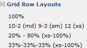
Grid systems are the fastest and easiest way to create responsive web designs. CommonSpot supports any responsive grid system design making it easy to implement.
Read moreUse Cascading Style Sheets To Manage Your Web Design
Use Cascading Style Sheets To Manage Your Web Design
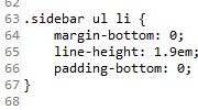
Cascading Style Sheets help to ensure a consistent ‘look and feel’ throughout your site. Changes to style, fonts, sizes, etc. can be made in one place and incorporated automatically throughout all pages that utilize the style sheet.
Read moreLock Down Styles To Protect The Integrity Of Your Brand
Lock Down Styles To Protect The Integrity Of Your Brand
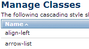
CommonSpot supports any design, and applying style classes to your content is easy. Designers can register a library of available classes and assign them to content objects, making it easy for users to apply style classes from within the CommonSpot interface.
Read moreServe Targeted Content Across Multiple Devices
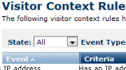
Serve Targeted Content Across Multiple Devices
CommonSpot includes powerful tools for serving context-specific, personally relevant content across devices for a more compelling web experience that increases engagement and improves marketing success.
Read moreBootstrap Compatible

Bootstrap Compatible
CommonSpot CMS is 100% compatible with the Bootstrap framework for developing responsive, mobile-first projects on the web.
Read moreResponsive Breakpoint Preview
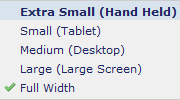
Responsive Breakpoint Preview
CommonSpot's Responsive Breakpoint Preview feature allows users to easily view, author, edit and approve changes to a page's content in any of the registered responsive breakpoint sizes.
Read moreResponsive (table-less) Forms
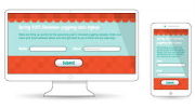
Responsive (table-less) Forms
CommonSpot's Simple Forms capabilities includes support for responsive forms using all standard CommonSpot and ADF field types, as well as additional HTML5 fields and a Label Above rendering option.
Read more