New in CommonSpot 10 are multiple features that give developers greater flexibility and control when building responsive websites. Designed to support the most popular HTML, CSS, and JavaScript frameworks, the new features help you implement fluid grids that provide the order and consistency needed for responsive layouts. Support includes site-level settings for responsive design frameworks, breakpoints, and managing grid layouts, as well as drag-and-drop page layout options.
- Grid Row Layouts – CommonSpot’s Container element now supports Grid Row Layouts. Designers and administrators can quickly analyze, create, or change how content is presented on responsive pages or templates. Granular layout control enables the easy creation of drop zones for content that can contain various sized columns (two 50% columns, three 25% 50% 25% columns, and so on) for maximum flexibility. You can show or hide grid outlines within the page, and choose from a variety of row layouts.
- Breakpoint Preview – The Breakpoint Preview feature allows developers to use one or more breakpoints to view page layouts for responsiveness across multiple devices, and quickly adapt where necessary.
- Table-less Forms – This new feature allows contributors to create forms that can be easily viewed on any mobile device regardless of screen size, including Label Above rendering. It’s a better way to build forms for mobile-first design.
- New Grid Row Layout left pane – A new left pane enables contributors to show/hide grid rows and easily drag & drop content into grid containers or ‘drop zones’. Contributors can also move entire grid rows or elements between cells.
Related Solutions
Screen Shots
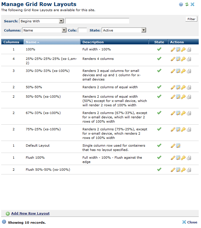
Administrators can register multiple Grid Row Layouts, that can then be specified in a Container's grid row.
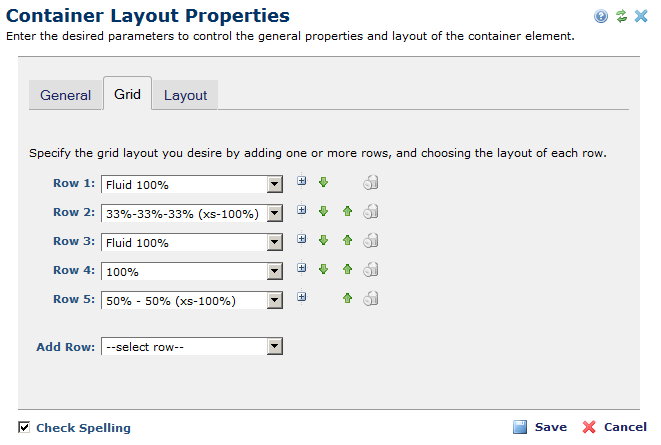
Container elements can now be configured to render as a responsive grid, and each row can have a different Grid Row Layout.
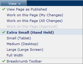
Users can change the size of the CommonSpot workspace to simulate a specified device size.