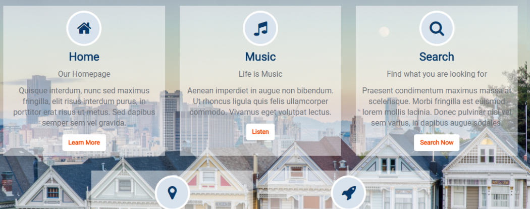
Icon Textblock on Background Image
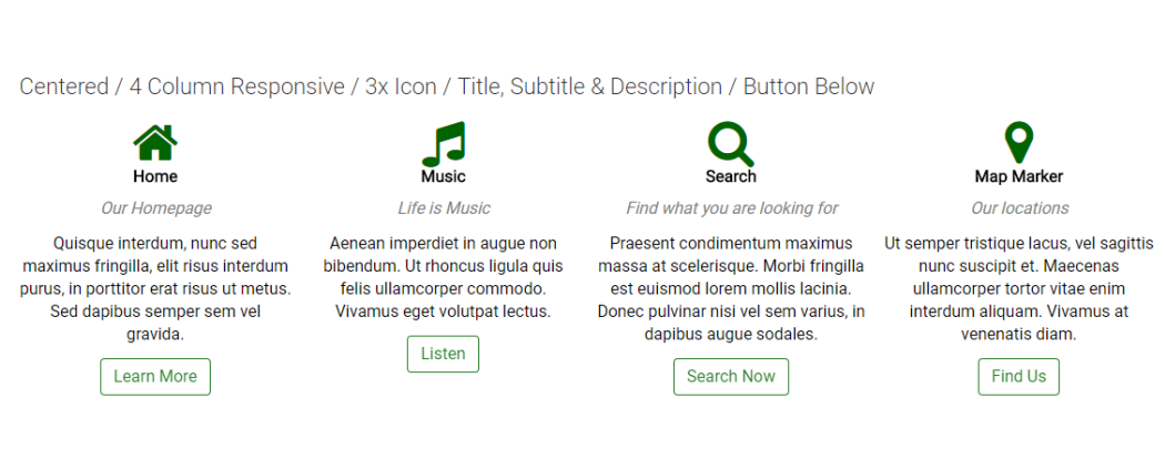
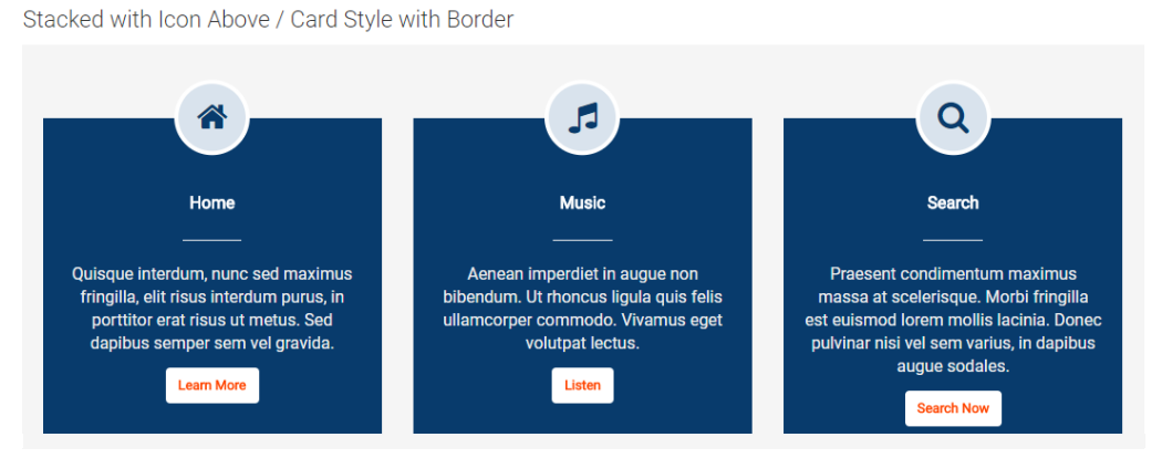
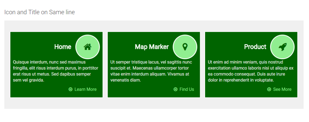
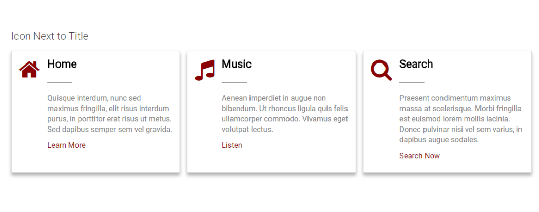
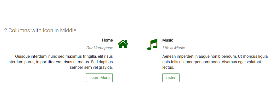
This CommonSpot Widget, Icon Textblock, displays the Icon on top, then the title, an optional underline, and description text with an optional link rendered at the bottom. Using this widget on your homepage or landing pages will allow you to select and highlight your sites deeper content with a modern responsive style.
Bind this widget’s Generic Render Handler and Metadata Form to your own Custom Element content object or use the optional Example Global Custom Element. With many options, like selecting the number of Grid Columns for Large, Medium, Small and X-Small devices, and setting Color and/or Alignment for the Title and Description text, this widget can be configured to display your content with many different looks.
For developers, the element fields, Generic Render Handler file and included Cascading Style Sheet file can all be modified to fit your specific content’s custom display scenario.
The Icon Textblock Widget offers the following configurable properties via the Custom Metadata Form bound to the Generic Render Handler.
Layout & Card Properties (tab)
Icon Textblock Layout options: stacked, icon & title on same line, icon next to title and text or two column wrap (with icons in the middle)
Click here for details of the Card Properties tab that is shared by the Icon Textblock, Icon Textblock Counter and Image Textblock.
General Properties (tab)
- Element
- Background Color - select not set, plus the standard named colors. If browser supports it, the options display in the color identified.
- Padding: top, right, bottom and left in pixels from 0 to 99 when choosing units option other than none.
- Background Image - Option to select an image to use as a background.
- Background Image Focal Point - (pick one of 9 options)
- top left, top middle, top right
- center left, center middle, center right
- bottom left, bottom center, bottom right
- Columns:
- Small Phone - 1 to 4 columns
- Phone - 1 to 4 columns
- Tablet - 1 to 4 columns
- Desktop - 1 to 4 columns
- Large Desktop - 1 to 4 columns
- Gutter Margin - none, 15px, 30px, 45px, 60px
Icon Properties (tab)
- Icon Style - plain option depicted above
- Icon
- Size - 12 sizes to choose from
- Color - many colors to choose from
- Icon Style - circle, rounded corners or square options have additional fields
- Border Size - 1 to 5 pixels
- Background Color - many colors to choose from
- Border Color - many colors to choose from
- Icon Inner Spacing - the amount of space in pixels between the inner icon and the colored background border
Text & Line Properties (tab)
- Title
- Tag - div, p, h1, h2, h3, h4, h5
- Align - left, center right, inherit
- Size - many options
- Font Settings - Bold, Italic, Underline and Initial, Title, Upper and Lower case options
- Color - many options including 'not set'
- Subtitle
- Show - yes or no (yes reveals additional options)T
- Tag - div, p, h1, h2, h3, h4, h5
- Align - left, center right, inherit
- Size - many options
- Font Settings - Bold, Italic, Underline and Initial, Title, Upper and Lower case options
- Color - many options including 'not set'
- Line
- Show - yes or no (yes reveals additional options)
- Align - left, center right, inherit
- Size - many options
- Color - many options including 'not set'
- Style - 10% to 100% in increments of 10 This is the width of the line relative to the available space.
- Description
- Show - yes or no (yes reveals additional options)
- Tag - p, div, blockquote, h2, h3, h4, h5
- Align - left, center right, inherit
- Size - many options
- Font Settings - Bold, Italic, Underline and Initial, Title, Upper and Lower case options
- Color - many options including 'not set'
Link / Button Properties (tab)
Click here for the details of the Link/Button Properties tab, which is consistent with all Widgets.
Required Elements
Metadata Form:
-
CSW IconTextBlock
Generic Render Handler:
-
CSW IconTextBlock
Optional Elements
Global Custom Element:
-
CSW Icon Textblock Widget
Note: The Optional Element available for this widget is a Global Custom Element that has been configured with the required Field Types as well as the same Generic Custom Render Handler that is available as a separate download.
Alternatively, you can bind this widget’s stand-alone Generic Custom Render Handler to your own Custom Element (Local or Global) that contains similar fields, even if it has different field names. See the “Configure Generic Render Handler” section below for information regarding using your own Custom Element data object with this widget.
Suggested Custom Element Fields
- Title (Text Field)
- Icon (Text Field, Bootstrap Glyphicon Select or Font Awesome Select)
- Description (Large Text Area)
- LinkURL (CommonSpot Extended URL)
- LinkText (Text Field)
The Icon Textblock Widget has the following importable components in the master import packet:
- Global Custom Element
- Metadata Form
- Generic Render Handler
If you want to use the provided global Custom Element, do the following:
- Download the master import packet
- Import the Metadata Form
- Import the Global Custom Element
- Confirm the Metadata Form is bound to the Render Handler
If you plan on using your own custom element, do the following:
- Download the master import packet
- Import the Metadata Form
- Import the Render Handler
- Confirm the Metadata Form is bound to the Render Handler
- Map your Custom Element fields to the Generic Render Handler
For detailed information on how to import the various components, please see Importing Widgets.