


The Hero Carousel Widget renders a fully responsive, single or multi-page, carousel, that adds visual interest to your site and also provides a means of drawing attention to important messages or content.
This widget allows you to control the following aspects for each slide in the carousel:
- Slide Image
- Slide Title, position and style
- Slide Subtitle position and style
- Link/Button, its position and style
You can also specify the position of title, subtitle and link/button independently.
For smaller device sizes the Title text, Subtitle text and link/button will render underneath the hero image.
The widget also has a number of other options such as:
-
Display the next/prev navigation arrows.
-
Display pager icons visually indicating which slide is showing.
-
Automatically start carousel cycling from slide-to-slide when the page loads.
-
Adjust display height based upon the slide height.
-
Loop indefinitely.
-
Associate a link to each slide and display either link text or a button.
-
Show thumbnail preview images of the upcoming slide underneath the main slide for larger devices
For developers, the CSS and render handler can easily be modified to add additional functionality or to customize the carousel to your particular needs. Additional options can be added as well by adding them to the carousel’s Metadata Form and styles can be changed by updating the style sheet provided with the widget.
The Hero Carousel Widget offers the following configurable, 'carousel-wide' properties via its Metadata Form, which is bound to its Render Handler.

- Slide Wait Time - If 0, users will have to manually navigate the slides. Otherwise this is the time in milliseconds that slides display before they automatically transition to the next slide.
- Slide Transition Speed - The time in milliseconds, for one slide to transition to the next slide.
- Slide Transition Effect - The effect to use when transitioning the slides. Possible positions are: Slide, Fade, Cube, Coverflow, Flip
- Options -
- Show Next/Prev arrows - If enabled, next and previous navigational arrows will be displayed to manually navigate between slides.
- Play in infinite loop - If enabled, users can navigate from the last slide to the first slide, or first slide to the last slide, directly.
- Adjust slide height automatically - If enabled, and only when the device size is small enough to have the Slide text, subtitle and/or buttons appear below the slide image, the height of the slide will automatically adjust, base on how much text is displayed, as the user navigates.
- Show navigation dots - If enabled, a series of dots will be displayed at the bottom of the slide, highlighting the current slide and allowing the user to quickly navigate to any slide by clicking the dots.
- Show thumbnail navigation - If enabled, thumbnails of the slides are shown below the current carousel image, allowing users to see and navigate to previous and next slide(slide). The current slide is centered.
- Keep image fixed height - If enable the slide image will be a fixed height (controlled in the CSS) based on the size of the device. Otherwise the image will be scaled proportionally, were the height of the image is a ratio to the screen width (also controlled in the CSS).
- Pagination Style - Options are: none, bullets, fraction or progress bar.
- Pagination Alignment - Location of the pagination controls: left, left center, center, right center or right.
Link/Button Properties (tab)

See a detailed explanation of the Link/Button Properties tab here.
General Properties (tab)

The Hero Carousel has part of the rendering control in the Custom Element Data itself.
You can select your image here:

Define how the Title text will display using the standard properties described on the Common Widget Properties page.

Similarly define your Description text and how it will look:

And finally, define the Link or Button text and its rendering ...

The major benefit of this arrangement is that each slide can be unique.
Each slide in the carousel can be configured independently, allowing you to specify the following 'slide-specific' properties:
Slide & Image Properties (tab)

- Slide Background Color - Choose from the standard named colors. If browser supports it, the options also display in the color specified. Background color may be needed if text color is white and responsive resizes for a smaller display device.
- Image - The image for this slide.
- Image Focal Point - If the image is bigger than the area, what portion of the image to set as the focal point.
- Link URL - The URL to link to when the user clicks the link/button
Title Properties (tab)

- Title Position - How to position/align the textblock within the designated area. Makes most sense for 100% wide layouts, but also applicable for other layouts.
- Title - The main title for the slide.
- Title Appearance - Define how you want the slide title to appear.
- Tag - Choose the HTML element to encapsulate the title: p, div, or any of the h tags.
- Size - Choose the text size: 1x to 7x, extra large, inherit, large, medium, normal, or small.
- Font Settings - Set the font weight and font variant values.
- Color - Sets the text color. Choose from the standard named colors. Options show in the color named if the browser supports it/
- Background Color - Sets the background color of the selected tag. Has the same options as the Color field.
- Opacity - Options are in 10% increments from 10% to 100%.
- Padding - If units option other than 'none' selected may set top, right, bottom, and left; else, not displayed.
Description Properties (tab)

- Description Position - Controls placement of the description.
- Options include top, middle, and bottom. Each of these have left, center, and right.
- Choose option hidden and neither Description or Description Appearance fields are displayed.
- Description - Enter the text of the description.
- Description Appearance - Describe how you want the description to appear. Same controls as for title appearance.
Link/Button Properties (tab)

For a detailed explanation of the fields of this tab, click here.
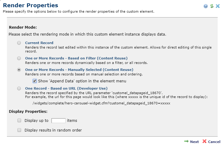
Each slide in the Hero Carousel is a separate custom element record. You can use the Custom Element's 'Render Properties' dialog to either dynamically filter, or manually select the slides.
The Hero Carousel Widget has the following downloadable components:
- Global Custom Element
- Metadata Form
- Generic Render Handler
Because this carousel’s render handler is written as a “generic" Render Handler you can either use the provided Custom Element , or use your own existing Custom Element on your site instead.
If you want to use the provided global Custom Element, do the following:
- Download & Import the Metadata Form
- Download & Import the Global Custom Element
- Confirm the Metadata Form is bound to the Render Handler
If you plan on using your own custom element, do the following:
- Download & Import the Metadata Form
- Download & Import the Render Handler
- Download & Import the Global Custom Element
- Confirm the Metadata Form is bound to the Render Handler
- Map your Custom Element fields to the Generic Render Handler
For detailed information on how to import the various components, please see Importing Widgets.